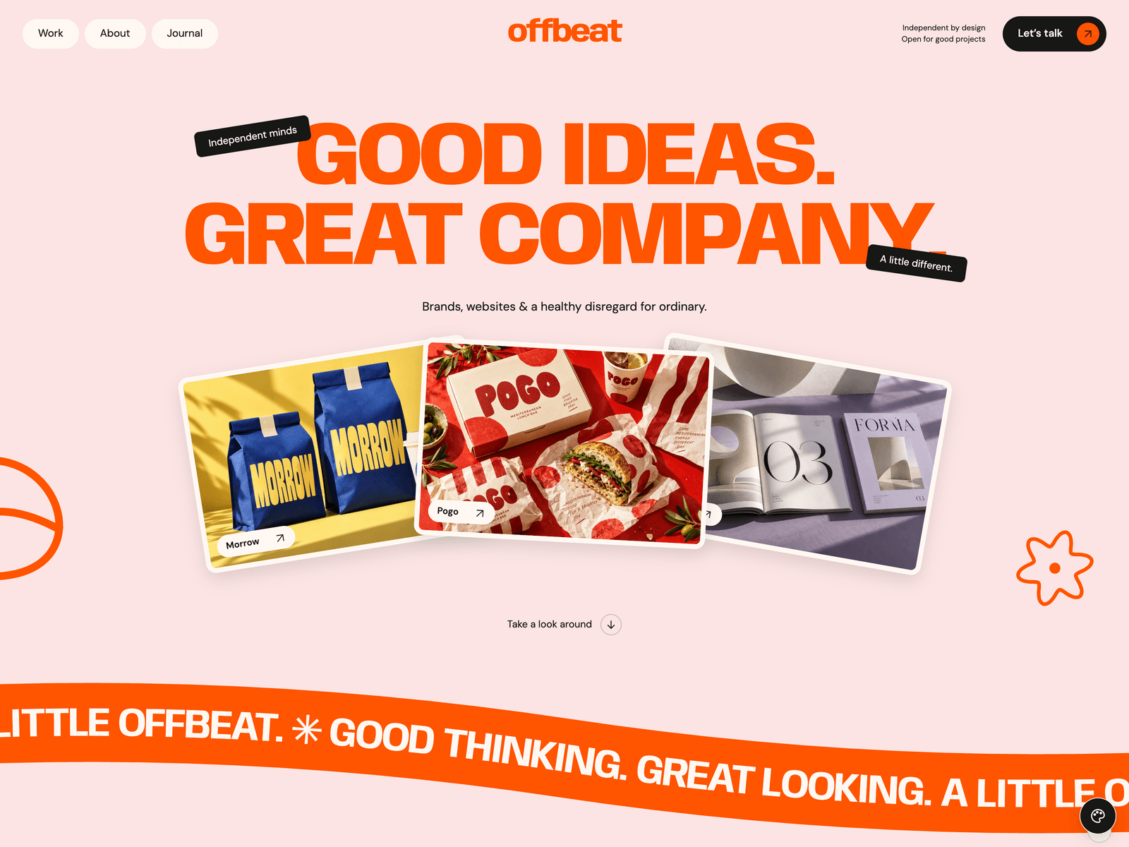
Offbeat
A playful, expressive portfolio for a studio or a solo creative. Huge type in the accent colour you pick, tilted project cards, a curved ticker, a winding service path, stacked testimonials, a chat-style FAQ, case studies and a journal.
One payment for Offbeat and everything else - all 40 themes, every future release, and the Astro visual builder included.
See Offbeat in action
Every page and section is part of the download. Use these as launch-day templates - keep the structure, swap the copy.
Offbeat is a portfolio for a small creative studio or a solo designer who wants the site to show some personality. The first screen is a huge two-line headline on a soft pink and peach canvas, with floating tags and three tilted project cards. The headline, the ticker, the service path, the illustrations and every button take one accent colour: orange by default, any hex value you set, and the demo has an accent picker with six presets. A curved ticker runs below it, then a studio statement that colours in letter by letter as you scroll, the selected projects, six services along a winding line that draws itself, a moving image gallery, stacked testimonials, the latest journal posts and an FAQ written as a chat. Each project gets its own case study page, and the work page filters projects by service. Every word, project, service, article, form field and the accent colour live in src/config/site.ts. The contact form starts in an honest demo mode until you connect Formspree, FormSubmit, Netlify or your own endpoint.
Best Fit For
- Small branding and design studios
- Freelance designers, illustrators and art directors
- Personal portfolios that need case studies and a journal
- Creative teams that want a playful, colourful first impression
Full Page Set
Every page is real and editable - no placeholders, no "coming soon" stubs.
12 Sections Included
Every section is a ready-to-use Astro component. Add it to any page, customize via config, or remove what you don't need.
What's Included
Not just orange
Offbeat ships with an accent picker: orange, violet, cobalt, forest, rose and teal, and the choice is remembered across pages. Or set any hex value as appearance.accent in site.ts: the headlines, buttons, tags, ticker, service path, illustrations and favicon all follow it, with lighter tints and readable dark shades worked out for you. Keep the picker for your visitors or switch it off.
Projects that tell a story
Every project in site.ts becomes a case study page with its own story, palette and a link to the next project. The first three also form the tilted cards in the hero, and the work page filters them by service.
Motion with a point of view
A curved ticker, a statement that colours in as you read, a service path that draws itself and a testimonial deck you turn. The ticker and the gallery have pause buttons, and reduced-motion settings switch the movement off.
Studio or personal
structuredData.type switches the site between an Organization and a Person, so the same theme works for a team or for one designer. Add a language by copying one template file, right-to-left languages included.
Tech Stack
Config-Driven Setup
Offbeat keeps every string, the accent colour, the projects and their case studies, the services, the journal articles and the contact form's fields and delivery settings insrc/config/site.ts. Projects and articles are entries in site.ts rather than Markdown files, and the contact form stays in an honest demo mode until you choose a provider.
// src/config/site.ts
export const site = {
  name: "Offbeat",
  url: import.meta.env?.PUBLIC_SITE_URL || "https://example.com",
  appearance:     { accent: "#ff5400" },
  structuredData: { type: "Organization" }, // or "Person"
  hero:     { title: ["GOOD IDEAS.", "GREAT COMPANY."], projects: ["morrow", "pogo", "forma"] },
  projects: [{ slug: "morrow", title: "Morrow", category: "Brand identity", ... }, ...],
  services: { items: [{ lead: "BRAND", trail: "STRATEGY", icon: "target", ... }, ...] },
  journal:  { posts: [{ slug: "a-better-brief", category: "Studio practice", ... }, ...] },
  forms: {
    contact: { delivery: defineDelivery({ provider: "demo" }), fields: defineFields([...]) },
  },
};Built to be edited by AI
Offbeat ships an AGENTS.md and
a CLAUDE.md at the project root.
Claude Code, Cursor, Copilot, and Codex read them the moment you open the folder.
So your agent starts knowing which file to edit, which design decisions are deliberate, and which parts of the theme break quietly if touched. You get the right change on the first pass instead of a confident guess.
- A task map. Every common request routed to the exact file, so no time is spent exploring.
- Design invariants. The decisions that make the theme worth buying, marked do-not-touch.
- The traps. The specific things that break this theme silently, written down.
- A done checklist. What to build, what to scroll, what to verify before claiming success.
# Offbeat agent guide

All visible copy, images, links, project bodies,
form fields/providers, SEO and theme identity live
in src/config/site.ts. Only include consumed
configuration. Components use getSiteConfig(Astro.url);
locale arrays replace in full. Do not locale-prefix
assets or form endpoints. Keep no-JS content readable,
reduced-motion safe, keyboard controls operable.
Animation lifecycle is in main.ts; clean up GSAP,
Lenis and listeners on Astro swaps.

Run format, check, test, verify:i18n, build and
verify:site after structural/config changes.
Excerpt. The full file ships with the theme.
Full documentation, ready before you buy
Browse the install guide, the site.ts reference, provider setup, deploy instructions, and the Offbeat-specific page - all live now.
More themes from the collection.
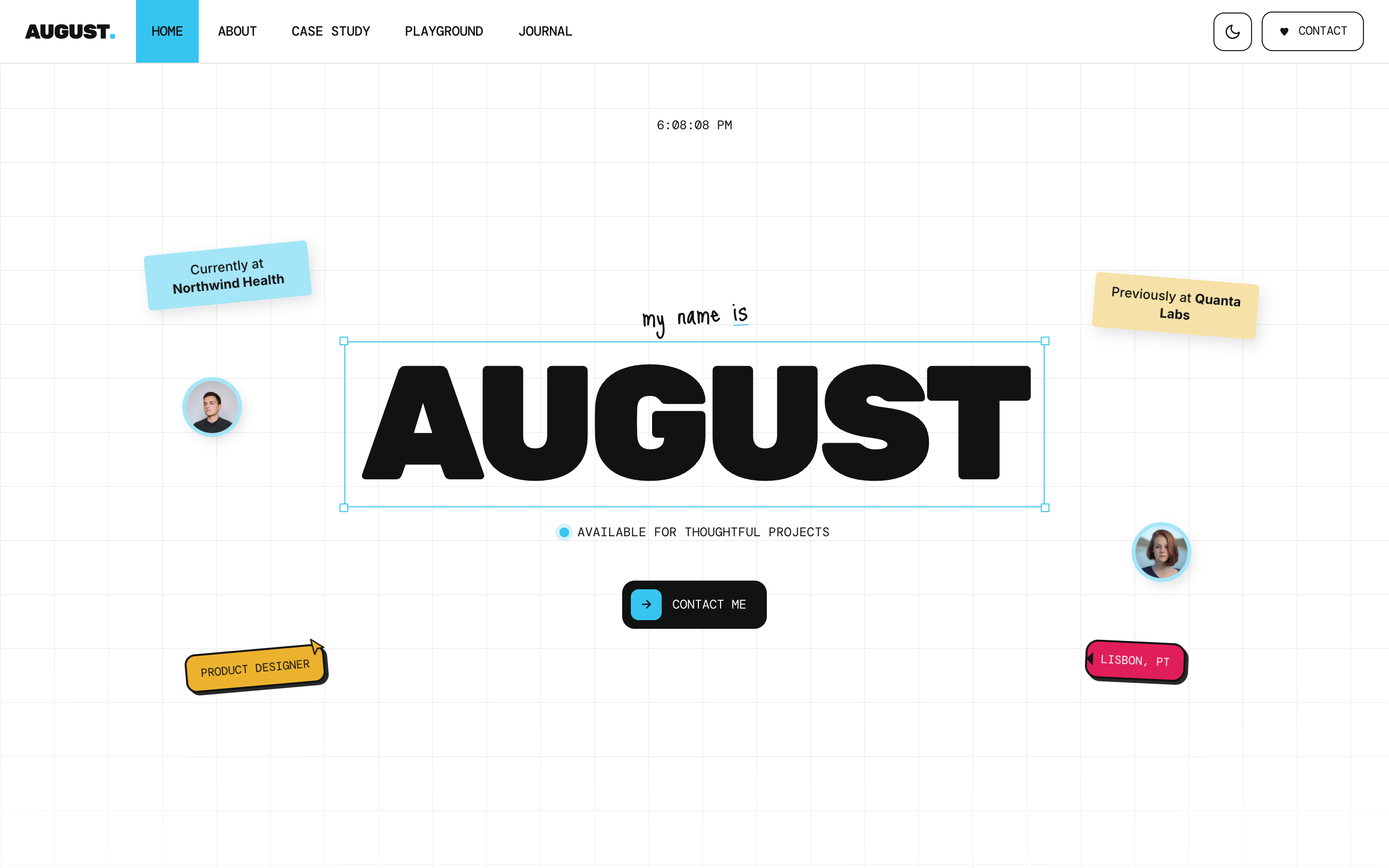
August
Personal / Portfolio / SaaS
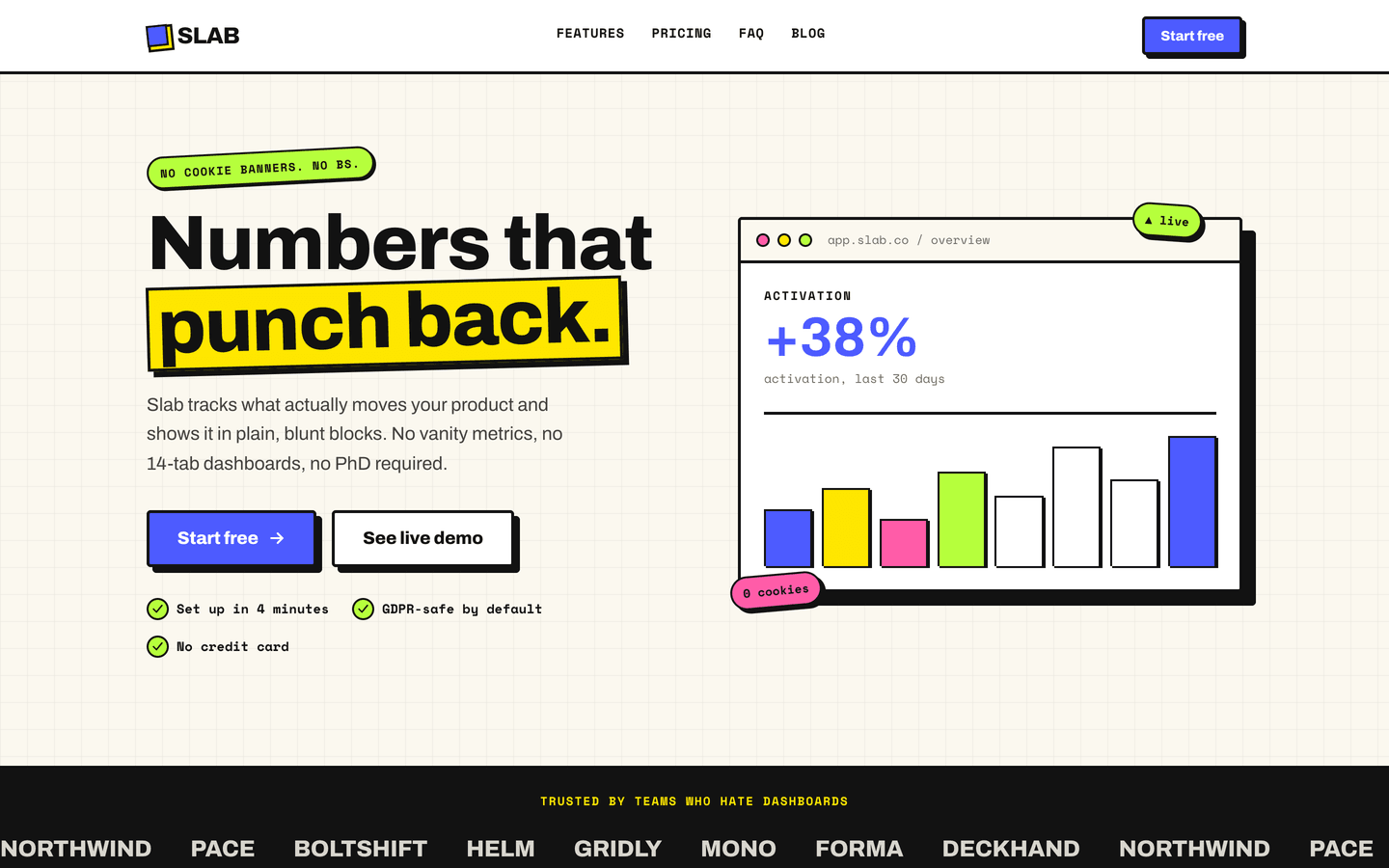
Slab
SaaS / Startup
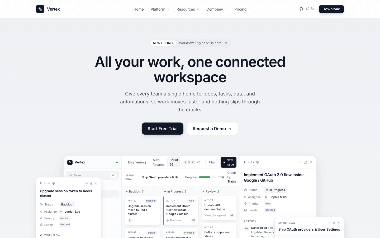
Vertex
SaaS / Startup
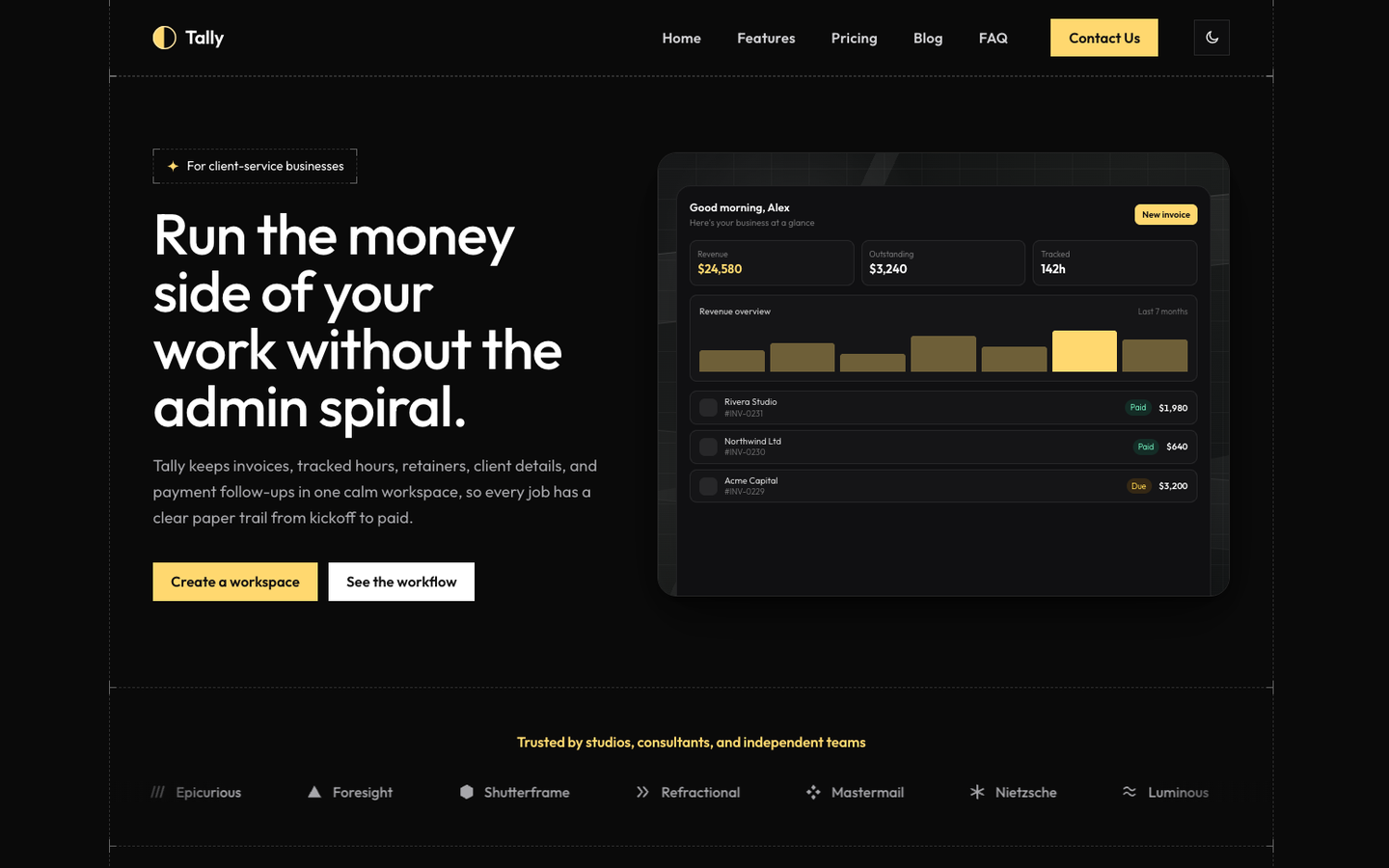
Tally
SaaS / Startup
Or get every theme - these included - with the All-Access Pass.