Best Astro Themes for Photographers and Portfolios (2026)
What actually matters in a portfolio theme, the mistakes that make image-heavy sites slow, and the free and premium Astro options worth considering for photographers, designers and studios.
Portfolio sites tend to fail in one of two ways, and they are almost opposites.
The first is the beautiful theme that fights your work. Enormous type, a scroll animation on every element, a cursor that trails a coloured blob. It looks impressive in a demo built around stock photography and it looks exhausting the moment you put real images into it, because now two things are competing for attention and the photos lose.
The second is the fast, tasteful theme that turns out to be a grid and nothing else. Fine for twelve images. Useless the moment you want to show a body of work as a sequence, with an intro, an order you chose, and a page that belongs to that project rather than to the site.
Astro is a genuinely good foundation for solving both. This is a look at what to check before you commit to a theme, which ones are worth your time, and the specific things that quietly make image-heavy sites slow.
Full disclosure before we start: we build and sell several of the themes mentioned here. I have tried to be useful about where they are the wrong choice, and the section on third-party options is there because our catalogue is not the whole market.
Why Astro suits photography sites
Astro ships no JavaScript unless a component asks for it. On most site types that is a nice-to-have. On a portfolio it is close to the whole point, because your image payload is already large and you do not want a framework runtime competing with it for bandwidth on someone’s phone.
The image tooling matters just as much. Astro processes local images at build time, generating responsive AVIF and WebP variants and writing explicit width and height attributes into the markup. Those attributes stop the page reflowing as photos arrive, which is the jump you have seen on badly built galleries where you go to click something and the layout moves.
The last piece is that everything builds to static files. A portfolio has no login, no cart and no per-request logic, so there is nothing to run on a server. You get a folder of HTML you can host anywhere, which is both cheap and very hard to break.
What to check before you pick a theme
Most theme comparisons stop at “does it look nice.” These are the questions that actually determine whether you will still like the site in six months.
Does it use Astro’s image pipeline, or plain <img> tags? This is the single biggest difference between a fast photo site and a slow one, and it is invisible in a demo where the author has already hand-optimised every asset. Look at the documentation or ask directly. If the answer is that you drop files into a folder and reference them with a bare <img src>, you are the one who now owns resizing and format conversion for every photo you ever add.
Is there a real project structure, or just a gallery? A flat grid says every image is equal. Most photographers do not work that way. If you shoot in series, commissions or campaigns, you want each one to have its own page, its own running order, and its own text. Retrofitting that later means rebuilding the content model.
Does the lightbox work with a keyboard? Open one in the demo and press the arrow keys, then Escape. A surprising number do nothing. It is a small thing that tells you whether the author thought about people using the site or only about how it photographs in a screenshot.
How much motion is baked in? Ask whether animations respect prefers-reduced-motion, and be honest with yourself about how much movement you want around still images. Motion is very easy to add later and unpleasant to strip out.
What happens to the demo photography? Covered in the FAQ below, but worth repeating here: assume you cannot keep it. Every image in the demo is a placeholder.
The themes worth a look
Aperture
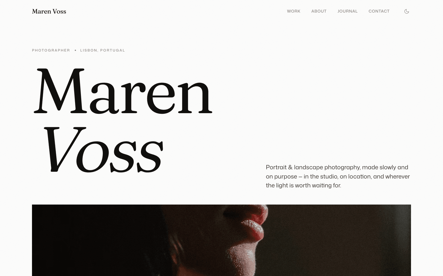
The one we built specifically for this use case. It is a light and dark canvas with a cursor-follow work index, numbered series, and a keyboard-driven lightbox. The structure is series-first rather than grid-first, so each body of work gets a detail page instead of being flattened into one wall of thumbnails. Eleven page templates including a journal, so you can write alongside the work.
Pick it if you think in projects. If you genuinely just want one long scrolling feed, it is more structure than you need.
August
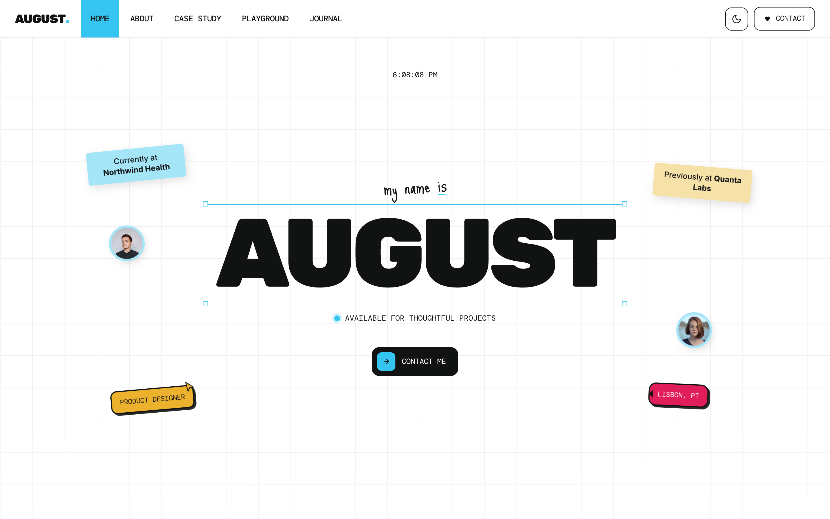
Built as an interactive design canvas: a faint working grid, sticker notes, polaroids, a stacking folder-card case-study deck, a lightbox gallery. It has a strong personality, which is exactly the thing to be careful about. On the right work, mostly design and creative direction, it reads as confident. Behind quiet documentary or fine-art photography it will pull focus.
Pick it if your portfolio is also a personality piece. Avoid it if the photographs need silence around them.
Persona
Warm, simple, teal accents, a straightforward set of pages including a resume and a blog. Nothing about it is loud. It is the one to reach for when the site’s job is to be a credible home for your work and your contact details rather than an experience in itself.
Pick it if you want something you will not get bored of. It is the least distinctive theme on this list, and that is deliberate.
Studio
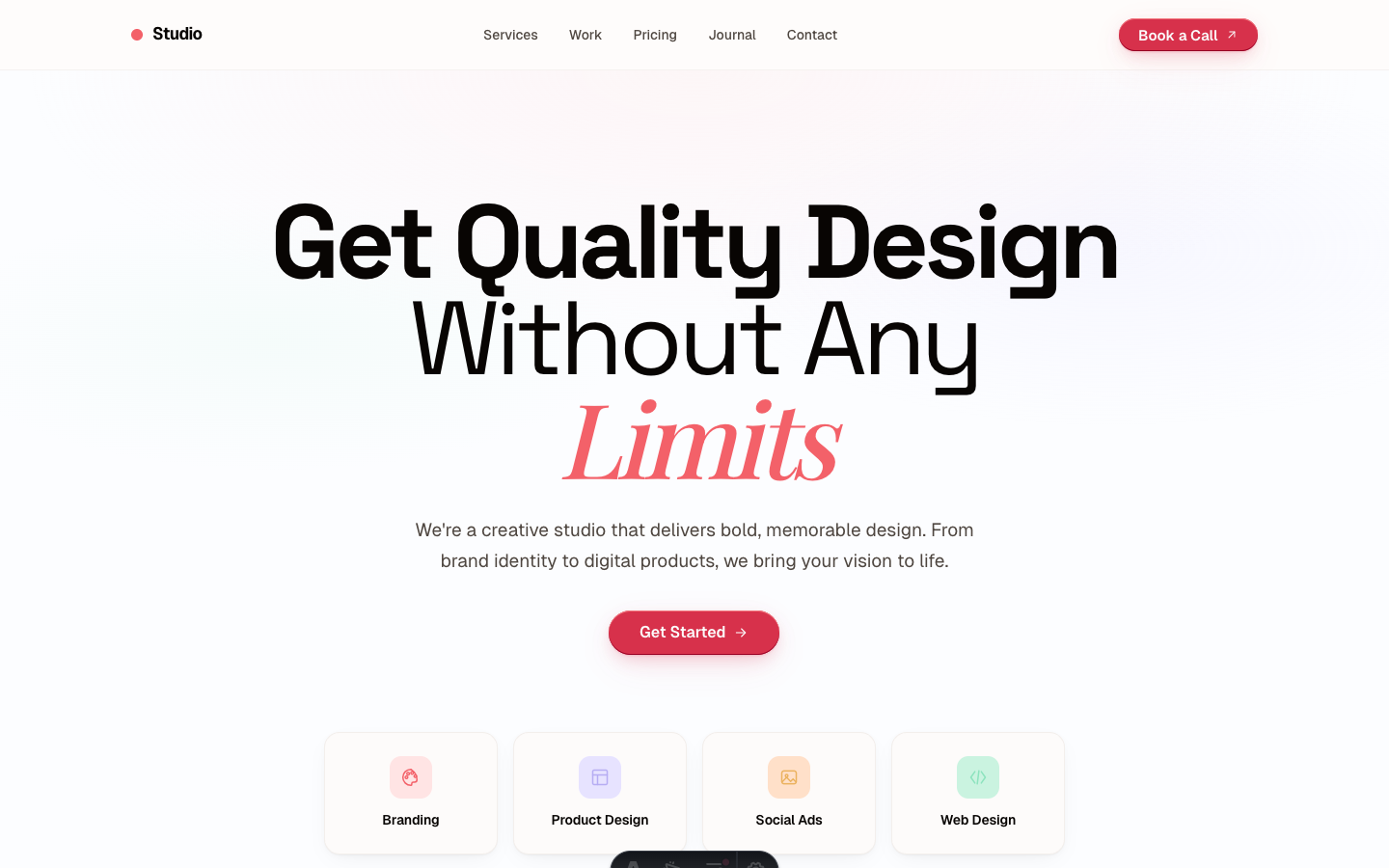
A creative agency theme rather than a solo portfolio: bold, coral accents, italic serif headings against a modern sans. Work, services, about, contact, blog. If you are a two-person studio taking commissions rather than an individual showing a body of work, the page structure fits better than a pure portfolio theme would.
Muse
An artistic personal blog with serif headings, pastel accents and offset border details, plus a gallery page. This is the writing-led option: for photographers whose site is as much essays and process notes as it is finished images.
Beyond our catalogue
The official directory at astro.build/themes is the first place to look, and it is free to browse with no affiliate incentive behind the ordering. Lambda Studio’s Lambda portfolio template is on there and worth a look if none of the above fit. Statichunt lists hundreds of Astro themes, free and paid, filterable by category. Cosmic Themes and Themefisher both have portfolio entries and long track records.
For free options, start with the free themes in the official directory before assuming you need to pay. A photography portfolio is one of the site types where a good free theme genuinely can be enough, because the content model is simple and the design work is mostly restraint.
Quick comparison
| Theme | Best for | Structure | Notable |
|---|---|---|---|
| Aperture | Photographers with bodies of work | Series with detail pages | Keyboard lightbox, light and dark canvas |
| August | Designers and creative direction | Case-study deck | Interactive canvas, strong personality |
| Persona | Individuals wanting something calm | Projects and resume | Deliberately understated |
| Studio | Small studios taking commissions | Work and services | Agency page set |
| Muse | Writing-led photographers | Blog with a gallery | Serif type, quieter pace |
Three things that will actually slow your site down
Unprocessed originals. A single 8 MB camera export dropped into a page does more harm than fifty properly sized images. If the theme does not process images for you, this becomes a habit you have to maintain forever, and it is the habit everyone eventually stops maintaining.
Fonts. Portfolio themes love a display face, and it is easy to end up loading four weights of two families before a single photograph appears. Two weights of one family is usually enough. Self-host them and preload only what appears above the fold.
A gallery script that loads on every page. Some themes load their lightbox library globally rather than only on pages that have a gallery. On a contact page, that is pure waste. Astro makes it easy to scope this correctly, so it is a fair signal of how carefully a theme was built.
Which one to pick
If you shoot in series and want the work to lead, Aperture. If your site needs a personality as much as a portfolio, August. If you want something restrained you will still be happy with in two years, Persona. If you are a studio rather than an individual, Studio.
And if none of those feel right, spend twenty minutes in the official Astro directory before buying anything. The best portfolio theme is the one that disappears behind your photographs, and that is a personal judgement no roundup can make for you.
Frequently asked questions
What is the best Astro theme for a photography portfolio? +
It depends on how you organise your work. If you shoot in bodies of work rather than one-offs, pick a theme with a series or project structure, where each project gets its own page with its own sequence of images. If your work is a single continuous stream, a well-built index grid with a keyboard-navigable lightbox is enough. Aperture is built for the first case. Beyond any single recommendation, the official directory at astro.build/themes and Statichunt both let you filter portfolio and photography themes from many authors, free and paid.
Is Astro good for image-heavy websites? +
Yes, and it is one of the better choices. Astro ships zero JavaScript by default, so a gallery page is HTML and CSS unless the theme deliberately adds interactivity. Its image tooling generates responsive AVIF and WebP variants at build time and sets width and height so the layout does not shift while photos load. The practical result is that the photos become almost the only thing the browser has to download, which is what you want on a portfolio.
Can I use the demo photos that come with a portfolio theme? +
Usually not, and this catches people out. Most theme demos use stock photography licensed to the theme author for display purposes, not sublicensed to buyers. Assume every demo image is a placeholder you must replace with your own work before launch. Reputable authors state this in their license or documentation. If a theme's marketing is vague about it, ask before buying, and never leave demo photography on a live client site.
Do I need a CMS for a photography portfolio? +
Not necessarily. Portfolios change less often than blogs, and many photographers are happy adding a folder of images and a Markdown file per project. If you would rather not touch the repository, you can pair Astro with a Git-based CMS such as Decap or Pages CMS, use a headless CMS, or use a visual builder that edits the rendered page and exports a real Astro project. All three keep the site static.
How many images can an Astro portfolio page handle? +
There is no hard limit, but there is a practical one. Modern formats and lazy loading mean a page with 40 to 60 photos can still load quickly, because only the ones near the viewport are fetched. The number that hurts is the number of full-resolution originals shipped without processing. One unoptimised 8 MB export does more damage than fifty properly sized images, so the theme's image handling matters far more than the count.
Start from a production-ready Astro theme
Skip building the design from scratch. These themes are full Astro 7 + Tailwind v4 projects you own outright - and you can edit them visually, no code, with the AeroLaunch builder.