August
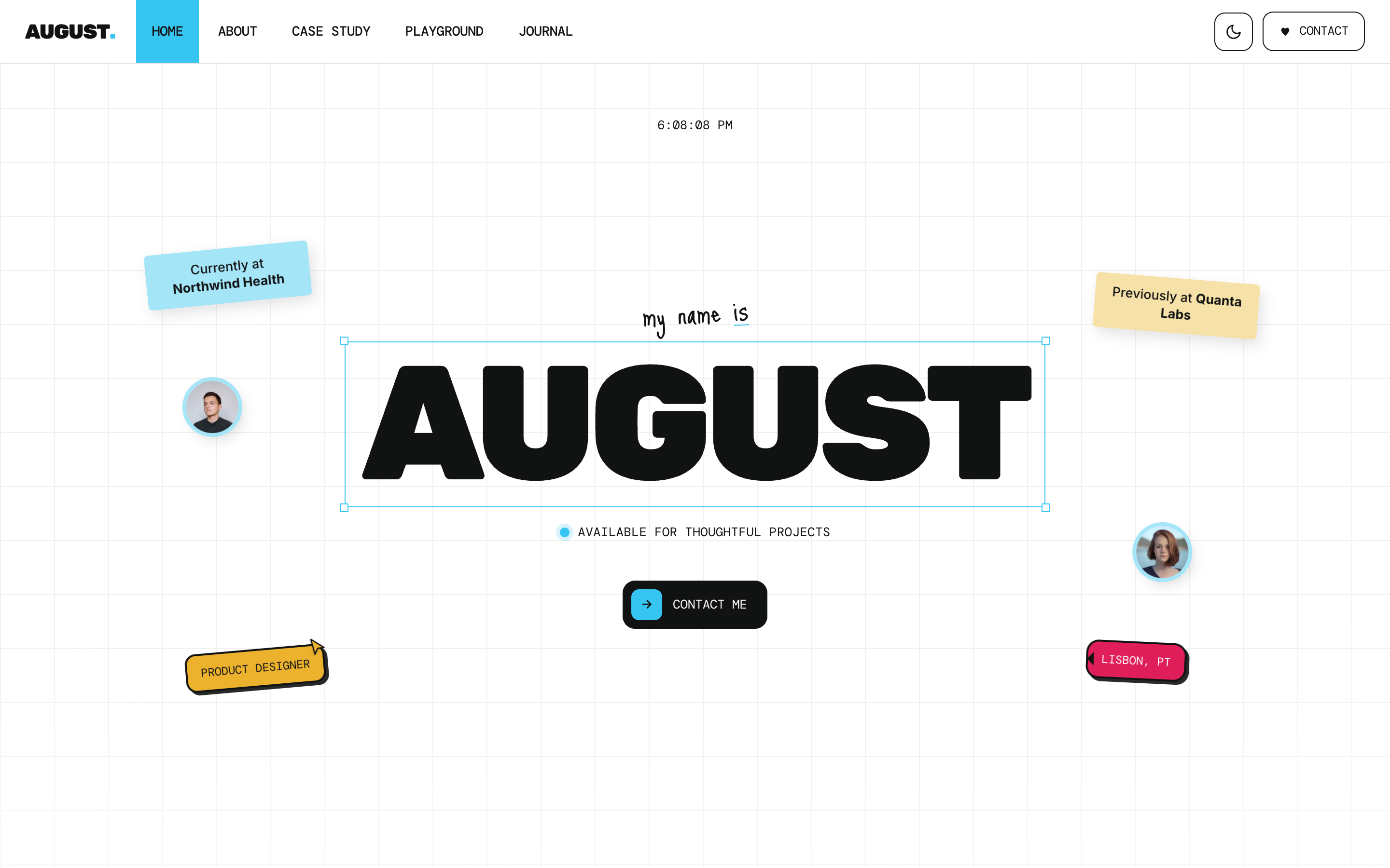
Personal & portfolio theme built as an interactive design canvas - faint grid, sticker notes, a stacking case-study deck, a lightbox gallery, and a built-in light/dark switch.
Editions: Astro (source), HTML (plain files, no build).
One payment for August and everything else - all 31 themes, every future release, and the visual builder included.
See August in action
Every page and section is part of the download. Use these as launch-day templates - keep the structure, swap the copy.
August is for designers, makers, and small studios whose personal site should feel made, not generated. It's an interactive design canvas: a faint working grid, sticker notes, a live clock, polaroids, selection-handle frames, a stacking folder-card case-study deck, and a click-to-open lightbox gallery. Slack-bright candy accents (cyan, magenta, amber, green) on clean paper, a bold display face, DM Mono labels, and a handwritten accent. It ships a complete site - 9 page templates and ~17 composable sections including a career timeline, stats, testimonials, a clients marquee, a journal, FAQ, and a newsletter - plus a real light/dark switch that remembers the visitor's choice with no flash on load. Case studies and journal posts are Markdown content collections, forms are provider-switched with no backend, and every visible string, link, color, image, and per-page SEO title flows from one config file. Reskins cleanly for a SaaS or freelance landing page.
Best Fit For
- Product, brand, and UX designers
- Freelancers and independent studios
- Developers and makers who want a personal home
- Anyone who wants a portfolio with a point of view
- Lightly reskinned: a SaaS or solo-founder landing page
Full Page Set
Every page is real and editable - no placeholders, no "coming soon" stubs.
17 Sections Included
Every section is a ready-to-use Astro component. Add it to any page, customize via config, or remove what you don't need.
What's Included
A Portfolio With a Point of View
August renders your site as a designer's working canvas - faint grid, sticker notes, a live clock, polaroids, and selection-handle frames - with Slack-bright candy accents on clean paper. It looks made, not generated.
The Interactions Buyers Remember
A stacking folder-card case-study deck that pins and cascades as you scroll, and a playground gallery where any frame opens full-screen with prev/next and keyboard nav. Plus a timeline, stats, testimonials, and a clients marquee - the sections a portfolio actually needs.
Light, Dark, and One Config File
A real header light/dark toggle that remembers the choice with no flash on load. And every visible string, link, color, image, and per-page SEO title flows from src/config/site.ts - brand the whole site without touching a component.
Forms, newsletter, and analytics - pre-wired
August is ready to connect to your preferred providers. Pick from the options below, drop in a single API key, and your contact form, newsletter signup, and analytics are live - no backend, no JavaScript, no glue code.
Contact form
The Contact section's <form> renders with no JS. Set one provider in site.ts; the form action wires automatically.
- Formspree50 free submissions / month, no domain restriction
- FormSubmitFree, no signup - just an email confirmation
- Netlify FormsFree 100/month - Netlify hosting only
Newsletter
The Newsletter form sends subscribers directly to your ESP. The email input name auto-adjusts per provider.
- MailchimpStandard EMAIL field; honeypot supported
- ConvertKit (Kit)email_address field; works with any form ID
- Buttondownemail field; lightest, indie-friendly
Analytics
Layout.astro injects the right script tag based on the provider you choose. No client-side branching.
- Google Analytics 4Paste your G-XXXXXXXXXX measurement ID
- PlausiblePrivacy-friendly, ~1 KB script, no cookies
- UmamiSelf-hostable, also cookie-free
Tech Stack
Config-Driven Setup
Every theme uses a single src/config/site.ts file
for customization. Change your brand, navigation, form providers, analytics, and section content
without touching component code.
// src/config/site.ts
export const siteConfig = {
  name: "Your Company",
  tagline: "Your tagline here",
  url: "https://yourdomain.com",

  navigation: { sticky: true, links: [...], cta: {...} },
  social:     { twitter: "...", github: "...", linkedin: "..." },
  seo:        { title: "...", description: "...", ogImage: "/og.png" },

  // ── Provider switches ────────────────────────────────
  contactForm: { provider: "formspree",  formspreeId: "your-id" },
  newsletter:  { provider: "convertkit", actionUrl: "https://..." },
  analytics:   { provider: "plausible",  plausibleDomain: "you.com" },

  // ── Section data ─────────────────────────────────────
  team, video, timeline, comparison, gallery,
  carousel, tabs, appDownload, map, footer,
} as const;Built to be edited by AI
August ships an AGENTS.md and
a CLAUDE.md at the project root.
Claude Code, Cursor, Copilot, and Codex read them the moment you open the folder.
So your agent starts knowing which file to edit, which design decisions are deliberate, and which parts of the theme break quietly if touched. You get the right change on the first pass instead of a confident guess.
- A task map. Every common request routed to the exact file, so no time is spent exploring.
- Design invariants. The decisions that make the theme worth buying, marked do-not-touch.
- The traps. The specific things that break this theme silently, written down.
- A done checklist. What to build, what to scroll, what to verify before claiming success.
# AGENTS.md - August

## Task map
| The client wants to change | Edit |
|---|---|
| Brand name, logo, favicon | site.ts -> identity     |
| Colors                    | site.ts -> theme        |
| Any homepage copy         | site.ts -> home.<block> |
| Add a page or an article  | new .md in src/content/ |

Rule: copy belongs in site.ts, never inside a component.

## Design invariants
Do not "improve" these. They are why the theme is worth its price.
- The accent stays loud. Do not mute or pastel it.
- Display headings stay oversized. The scale is the design.

## Traps
The things that break this theme silently, written down,
so your agent does not have to discover them by breaking them.

## Before you say you are done
npm run build      # must succeed and emit every route
Scroll each page to the bottom. Report what you did not verify.
Excerpt. The full file ships with the theme.
The same design as plain HTML
No Astro, no npm, no build step. Unzip the folder, open index.html straight from your disk and it works. Every page is a plain .html file you edit in any editor, the styling lives in one readable CSS file with the colours at the top, and an optional Tailwind folder is there if you want utility classes back. Deploy it to any static host: Netlify, Cloudflare Pages, GitHub Pages or plain cPanel.
Full documentation, ready before you buy
Browse the install guide, the site.ts reference, provider setup, deploy instructions, and the August-specific page - all live now.
More themes from the collection.
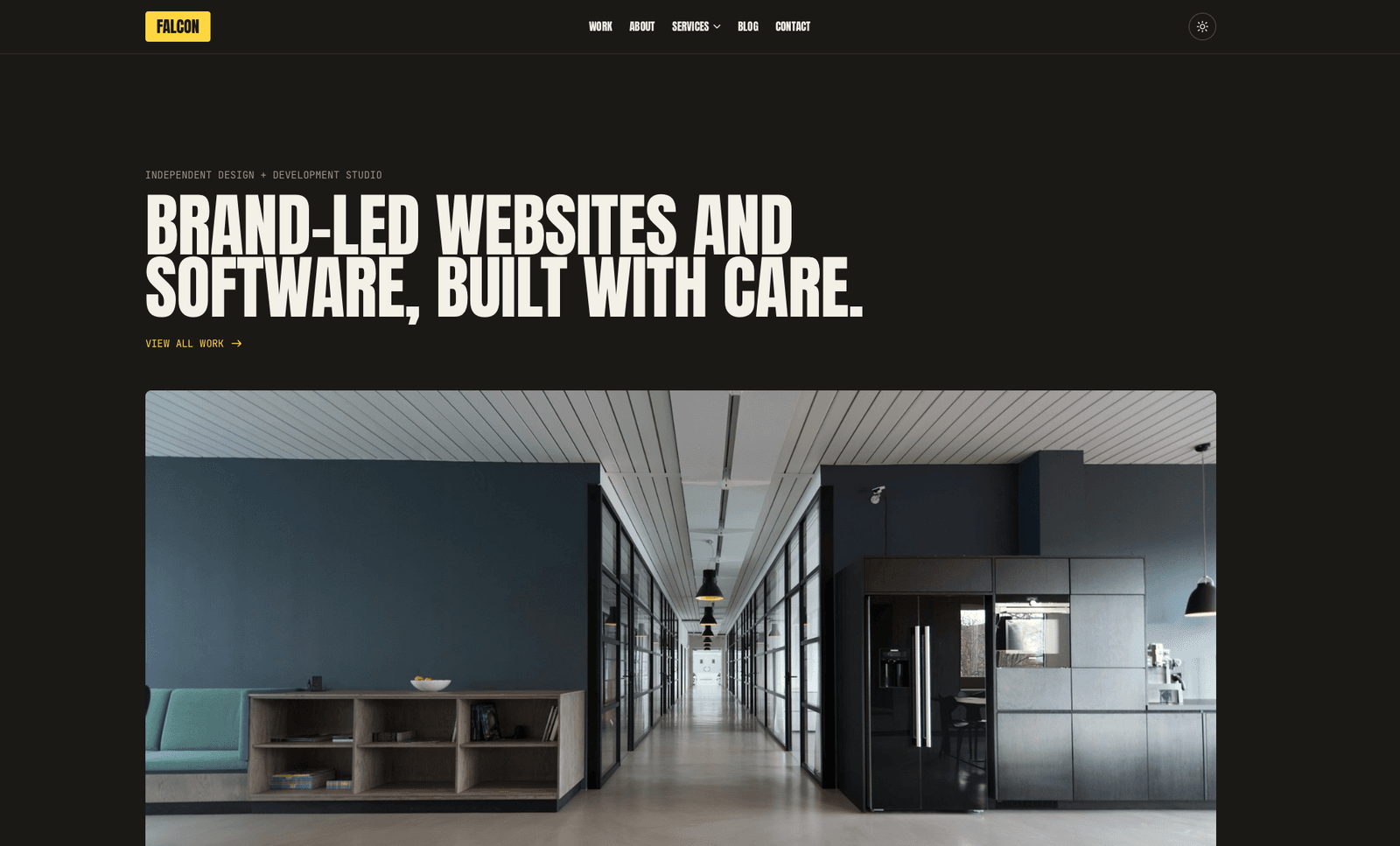
Falcon
Agency / Portfolio / Blog
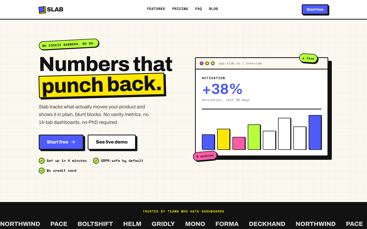
Slab
SaaS / Startup
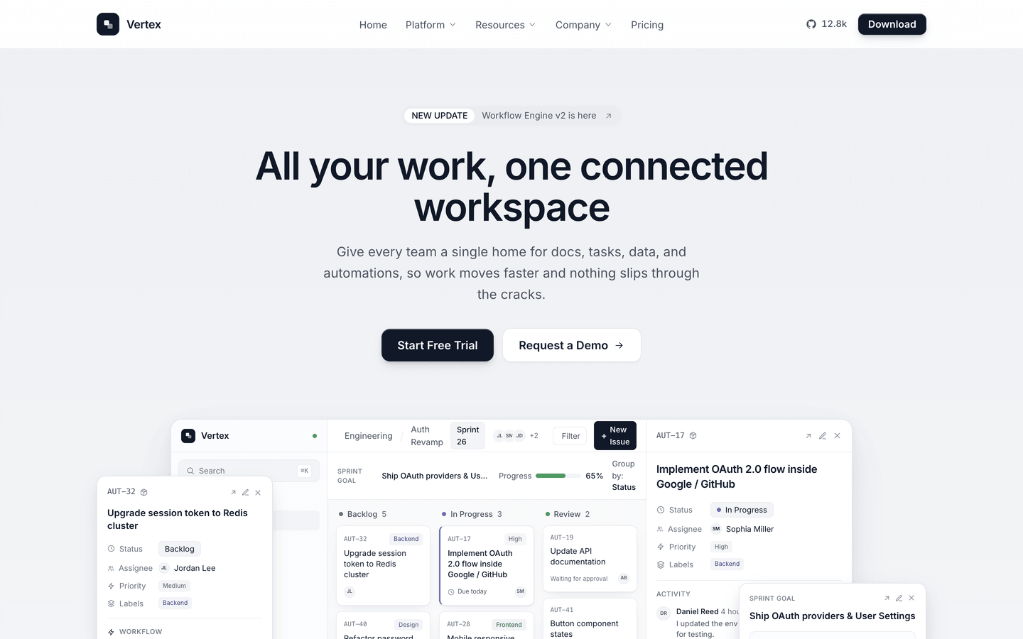
Vertex
SaaS / Startup
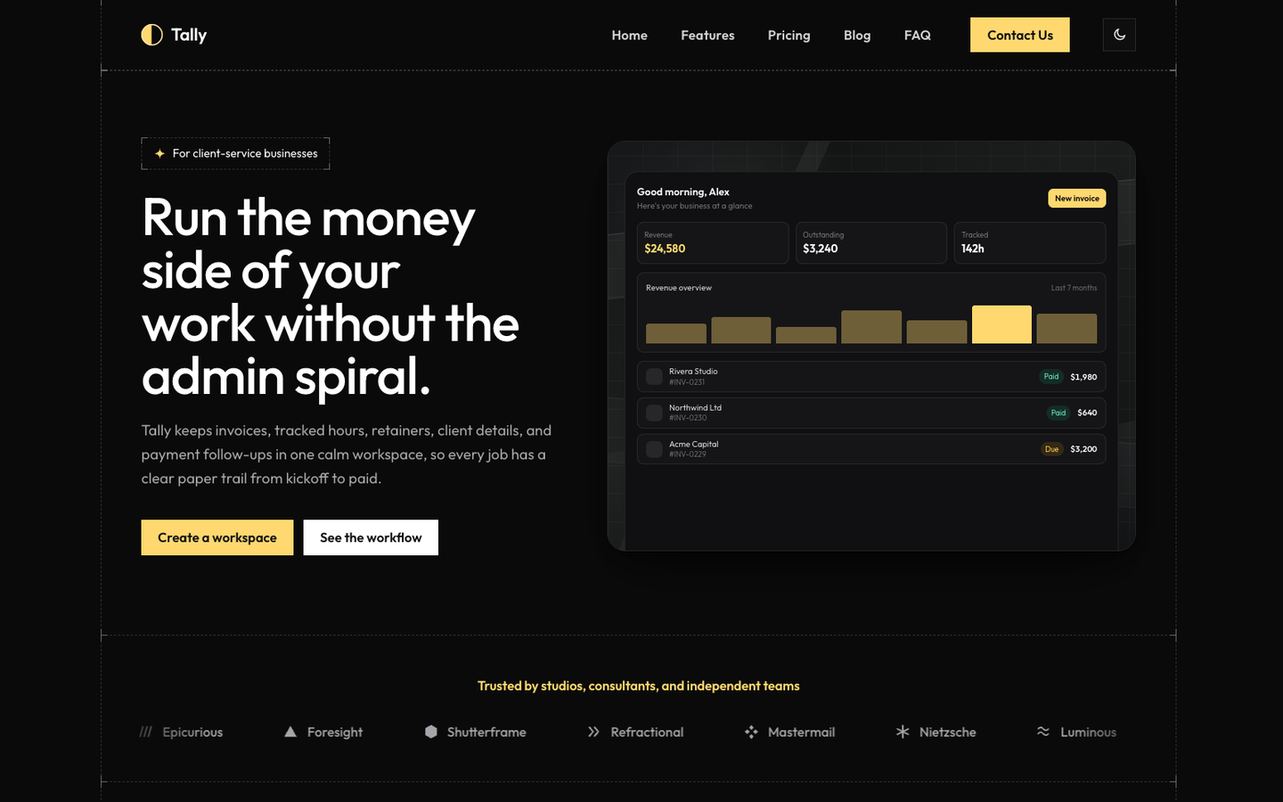
Tally
SaaS / Startup
Or get every theme - these included - with the All-Access Pass.