Best Astro Themes for SaaS and Product Websites (2026)
The best Astro themes for SaaS and software product marketing sites in 2026 - what a product site actually needs beyond a hero and a pricing table, plus standout picks for enterprise, indie and consumer-app products.
A SaaS marketing site has one job most templates get wrong: it has to look like the product actually works before anyone has touched it. A generic hero and a three-tier pricing table do not do that. The site needs to show something - a dashboard, a workflow, a piece of the interface - and it needs to keep looking credible as the company adds a changelog, case studies and a blog over the next two years.
That is where a lot of “SaaS” themes fall apart. They nail the hero and the pricing cards, then leave you improvising every page after that. This guide covers what an Astro SaaS theme actually needs to get right, and where six themes in the AeroLaunch catalog differ enough to be worth comparing directly.
What a SaaS site needs beyond the hero
- Product proof that does not require a screenshot yet. Most founders are shipping the marketing site before the product is polished enough to screenshot. A theme that fakes a convincing dashboard or workflow in CSS buys you time.
- Room to grow. Pricing, a changelog, case studies, a blog, a customers page - the pages a company adds as it matures. Bolting these on later, in a different visual language than the homepage, is how marketing sites end up looking stitched together.
- Speed that matches the pitch. If the product’s whole promise is that it is fast and modern, a marketing site that takes three seconds to paint undercuts the message before a visitor reads a word.
- One place to edit everything. Pricing changes, a new integration logo, a reworded headline - these should be a text edit in a config file, not a pull request into a component.
How six SaaS themes compare
| Theme | Best for | Product visual | Blog / changelog |
|---|---|---|---|
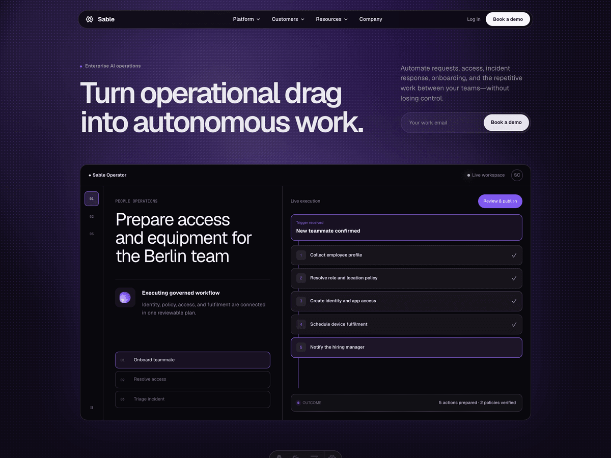
| Sable | Enterprise AI, ops and security products | Interactive operator workspace, workflow builder | Journal, no changelog |
| Slab | Indie SaaS and dev tools with a strong opinion | Fake product window with a live-looking chart | Neither, single landing page |
| Cirrus | Fintech, budgeting and consumer apps | iPhone mockup with animated dashboard cards | Blog, no changelog |
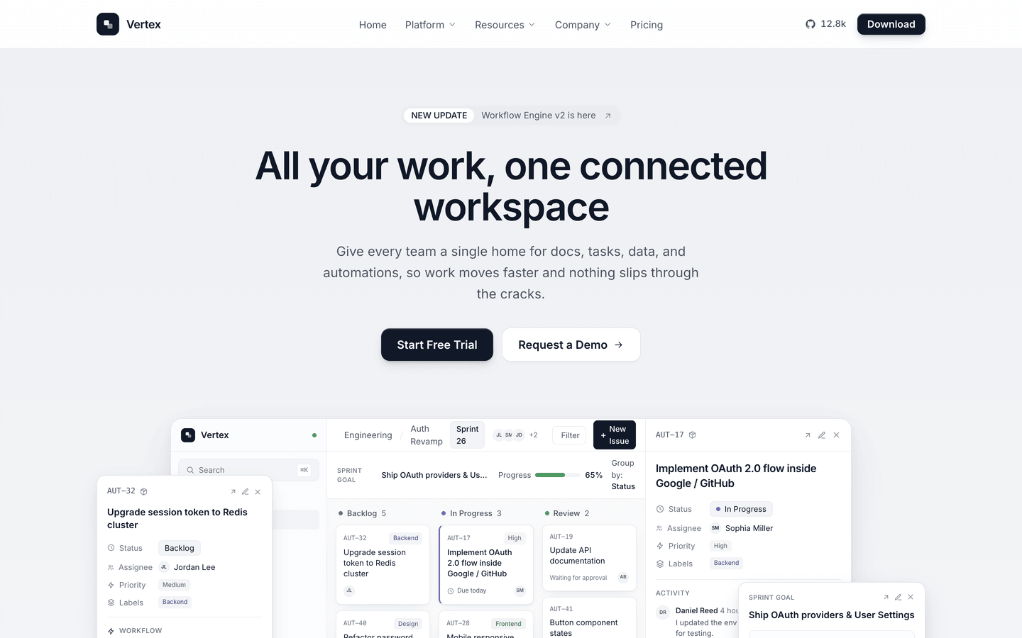
| Vertex | Pre-launch and early-stage SaaS | Kanban board plus automation-rule mockups | Blog and changelog |
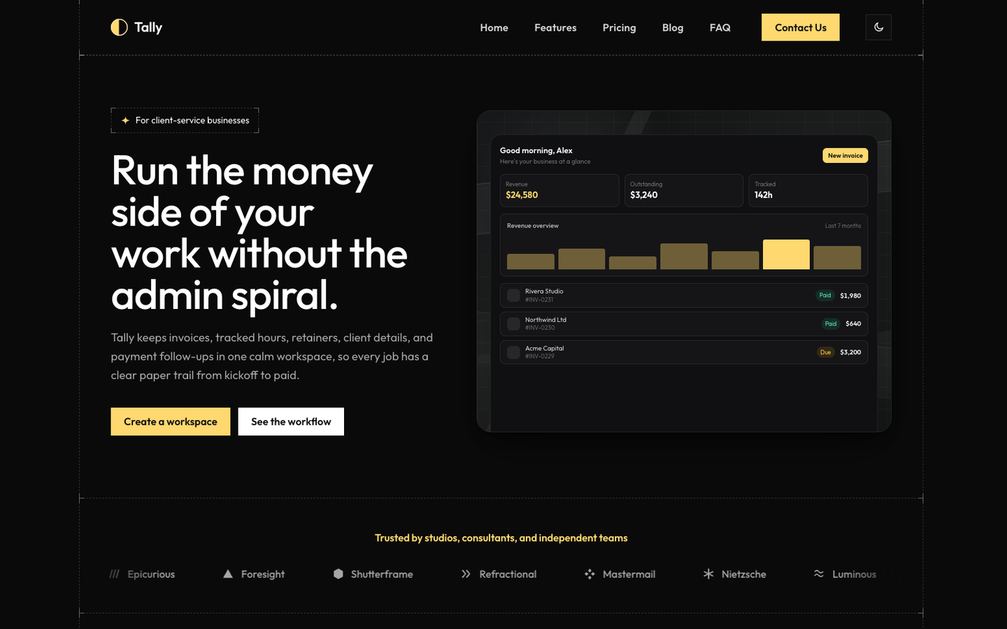
| Tally | Broad B2B software, CRMs, dashboards | Blueprint-framed app mockup, swappable | Blog and changelog |
| Nerve | AI and automation platforms | Live workflow simulator, ROI calculator | Insight articles, no changelog |
Standout picks by product type
Enterprise and operational software: Sable
Sable is built for the products where the buyer is a committee, not an individual - AI ops platforms, service desks, security and compliance tools. It skips the loud startup palette for pale product surfaces, deep interface panels and a single controlled violet accent, which reads as considered rather than trying to impress. The hero leads into an interactive “Sable Operator” workspace with switchable scenarios, and the rest of the site backs it up with five service pages, six full case studies and a journal, all generated from src/config/site.ts. If your sale takes a demo call and a security review before it takes a credit card, this is the register you want.
An opinion, on purpose: Slab
Slab is the theme for a product that does not want to look like every other SaaS landing page. Thick ink borders, hard offset shadows, a clashing block palette used flat with zero gradients, and buttons that visibly press into their own shadow when clicked. The hero fakes a product window with a live-looking bar chart, and the logo marquee loops with no visible seam. It is a single focused landing page, not a full site, which is exactly right for a launch page or an indie tool that wants to be remembered rather than blend in. Slab is also editable in the visual builder.
Calm and trustworthy: Cirrus
Cirrus is for products where the buyer needs to feel safe before they feel excited - budgeting apps, fintech, anything handling someone’s money. A soft clouds-gradient hero sits behind a real iPhone mockup with an animated finance dashboard, and the rest of the site runs on 21 composable sections built from live CSS and SVG visuals, not images: sparklines, donut charts, gauges. A real blog on Astro Content Collections rounds it out. Cirrus is also editable in the visual builder.
Ready before the product is: Vertex
Vertex is built for the stage most SaaS themes ignore - before you have paying customers or screenshots. A near-monochrome palette keeps the attention on the product, and a layered kanban mockup plus a run of live CSS UI panels (API connectors, automation rules, a dashboard) carry the entire product tour with zero image assets. It ships a waitlist with a working demo submit, a sticky-date changelog, a card-grid blog and a full 20-section homepage, so a team can launch the marketing site and swap in real screenshots later without redesigning anything.
The broadest fit: Tally
Tally covers the largest range of SaaS categories in the lineup - AI tools, CRMs, analytics, customer portals, vertical SaaS - because its blueprint-framed visual system and detailed live-CSS mockups are generic enough to read as “real product” for almost any category, while a persistent light/dark toggle and an in-page accent-color switcher let visitors (and you, while deciding on a brand color) try the site in different registers before committing.
AI and automation, made tangible: Nerve
Nerve is for AI agent and automation platforms that need to prove their model works, not just claim it. A strict editorial grid and restrained red signal color set a serious tone, and the site backs it up with a live workflow simulator that runs a scenario through a five-step automated trace, a department use-case navigator, and a working ROI calculator with configurable assumptions. It is the most demonstration-heavy theme in the catalog - useful if “trust the automation” is the actual sales objection you are up against.
Where else to look
The official astro.build/themes directory lists SaaS-category themes from independent designers, and shops like Colorlib and Cosmic Themes publish their own collections alongside dedicated SaaS templates such as SaaSify and Foxi. Worth checking before you buy: whether the theme is built on a current Astro version, whether the license covers client work if you are building for someone else, and whether the product visuals are real interactive mockups or a static screenshot dropped into a hero.
Getting started
Pick the theme that matches how your buyer actually decides - enterprise and considered for Sable or Nerve, confident and opinionated for Slab, calm and trustworthy for Cirrus, ready-before-launch for Vertex, broad and flexible for Tally. Every one of them keeps its copy, pricing and product visuals in a single config file, so the site can change as fast as the product does. Browse the full collection, or if you want to see one with your own words in it before deciding, open it in the visual builder.
Frequently asked questions
What makes a good Astro theme for a SaaS website? +
Three things beyond a nice hero: a way to show the product without a real screenshot on day one, a page structure that grows with the company (pricing, changelog, case studies, a blog), and speed, because a slow marketing site undercuts the exact claim a software product is making. A good SaaS theme also keeps every string of copy in one config file, so the founder can update pricing or a headline without opening a component.
Is Astro good for a SaaS marketing site, or do I need Next.js? +
For the marketing site, Astro is usually the better fit. Your app runs on whatever stack it needs to; the marketing site's job is to load fast, rank, and convert, and Astro ships zero JavaScript by default and only hydrates the interactive pieces you actually add. Next.js earns its keep once the site itself needs a database and user accounts - most marketing sites do not, and pay for that machinery in load time instead.
Can I show my product before I have real screenshots? +
Yes, and several Astro SaaS themes are built around exactly that. Cirrus, Vertex and Tally render their product demos as live CSS and SVG, not images - a dashboard, a workflow builder, an app screen - so the site looks like real software from day one. When you have actual screenshots, you swap one image path in the config and the mockup is replaced.
How much do premium Astro SaaS themes cost? +
AeroLaunch prices its SaaS themes at forty-nine dollars each, with Form Lab-style specialty themes and the newest releases sometimes higher. That is meaningfully below the seventy-five to one hundred fifty dollar range common on the curated theme directories, and well below hiring a designer for a from-scratch marketing site.
Do these themes include a blog and a changelog? +
The broader ones do. Cirrus, Vertex and Tally each ship a real blog on Astro Content Collections, and Vertex and Tally add a changelog page too, both edited as Markdown files rather than through a CMS login. Sable ships a journal instead of a changelog, since its audience is enterprise buyers reading case studies more than release notes. Slab, built for a single sharp landing page, skips both on purpose.
Start from a production-ready Astro theme
Skip building the design from scratch. These themes are full Astro 7 + Tailwind v4 projects you own outright - and you can edit them visually, no code, with the AeroLaunch builder.